- This topic has 10 replies, 11 voices, and was last updated 2 years, 8 months ago by
 Tanatorn Tilkanont.
-
AuthorPosts
-
-
2023-06-16 at 3:48 pm #40995
 Amnat KhamsiriwatcharaKeymaster
Please capture each visual and post in the forum
-
2023-06-18 at 7:47 pm #41030
 Zarni Lynn KyawParticipant
Since the data structure is different from the dataset in the video, in order to show
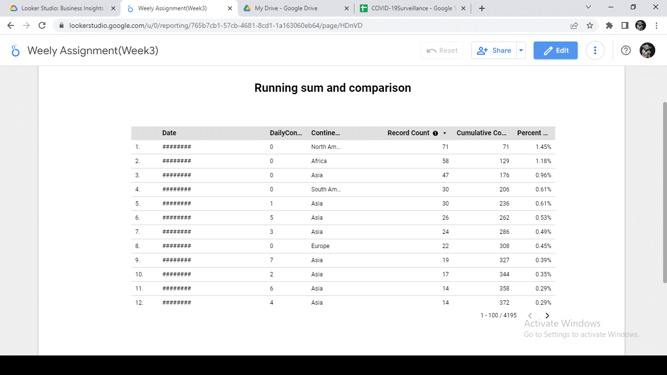
1) Running sum and comparison, I calculate monthly daily column and running cumulative column beside them. For the sake of clarity I filtered only with Thailand as a country.

For comparison, I used cumulative of each country and percentage of each country

2) Running Delta, for the sake of clarity I filtered Thailand and sorted by date,

3) Drill Down and Date, 1st picture is top level drill down and 2nd picture is 2nd level drill down


4) Pivot Table , I compare Country vs Year and use heatmap in each column to easy see the highest number

5) Score Card,

6) Timeseries,

7) Bar chart,

-
2023-06-19 at 9:06 pm #41037
 PREUT ASSAWAWORRARITParticipant
1. Running Sum and Comparison

2. Running Delta

3. Drill Down and Date

4. Pivot Table

5. Score Card

6. Time Series

7. Bar Chart

-
2023-06-20 at 9:37 am #41038
 ABDILLAH FARKHANParticipant
1. Running Sum and Comparison

2. Running Delta

3. Drill Down and Date

4. Pivot Table

5. Score Card

6. Time Series

7. Bar Chart

-
2023-06-23 at 11:35 am #41060
 Kawin WongthamarinParticipant


-
2023-06-23 at 3:44 pm #41064
 Siriphak PongthaiParticipant
1. Running sum and comparison

2. Running Delta

3. Drill Down and Date

4. Pivot Table

5. Score Card

6. Time Series

7. Bar Chart

-
2023-06-29 at 9:33 am #41159
 SaranathKeymaster
Great work!
-
2023-07-01 at 9:45 am #41170
 Saw Sha Kler LawParticipant
Running Sum and comparison
Running Delta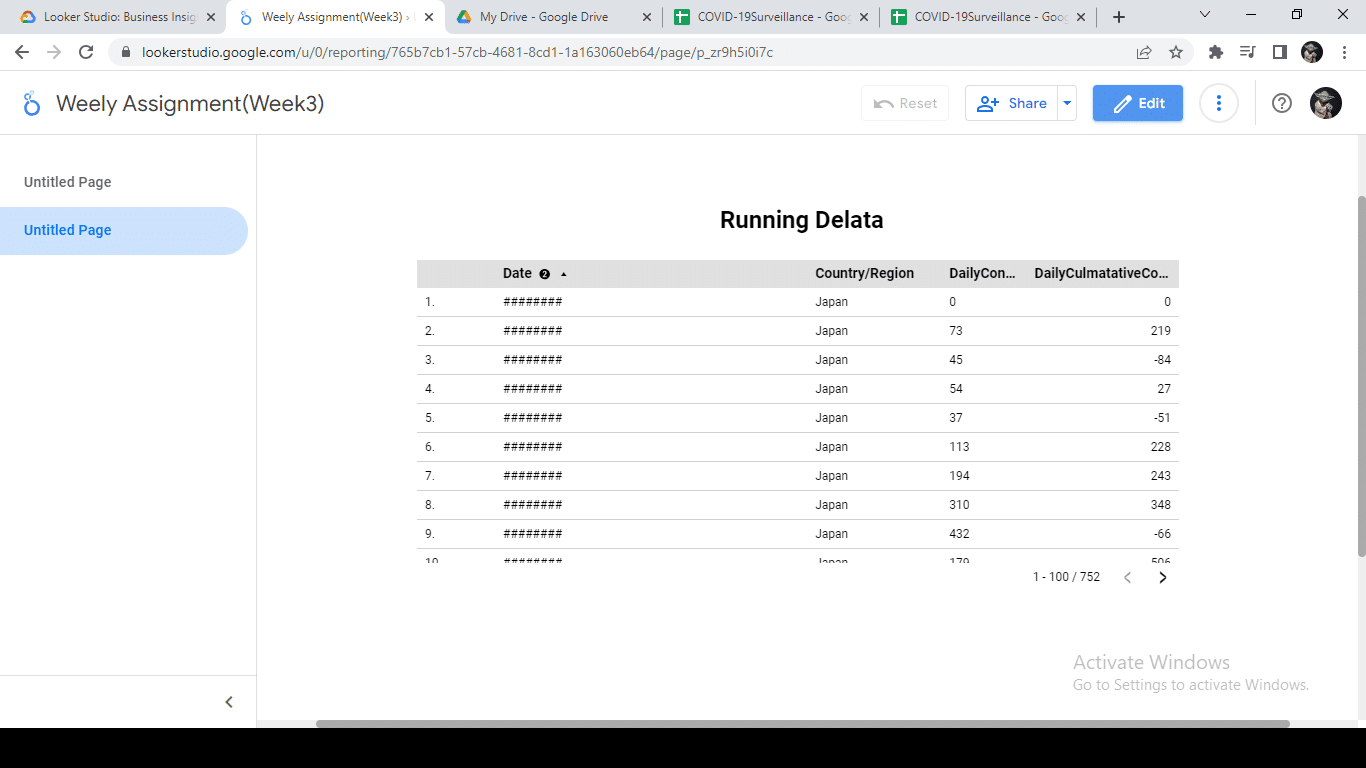
Drill Down and Date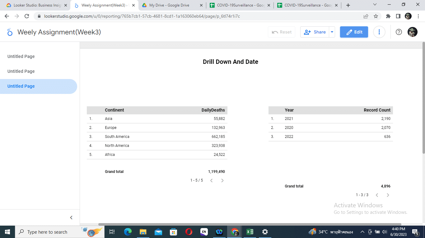
Pivot Table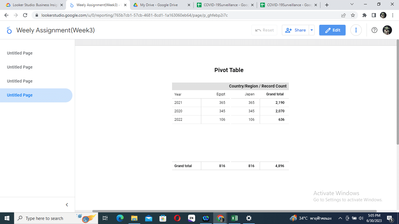
Score Card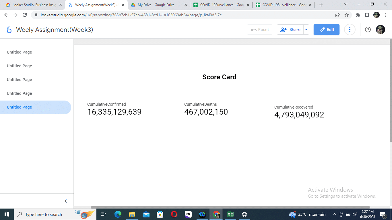
Time Series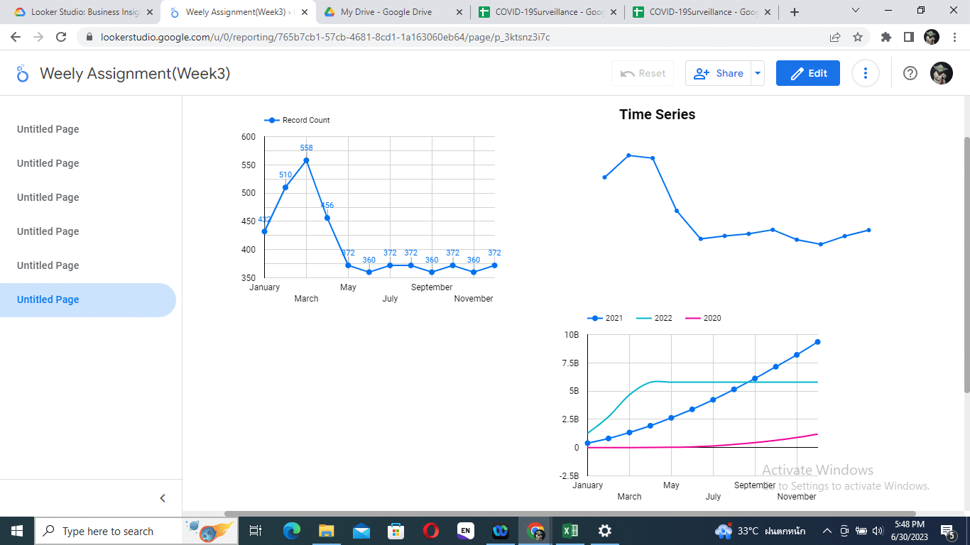
Bar Chart
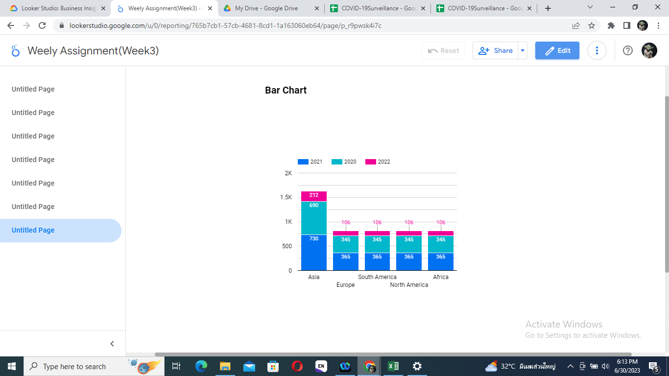
-
2023-07-01 at 10:37 pm #41185
-
2023-07-02 at 11:37 am #41188
 Tanyawat SaisongcrohParticipant

-
2023-07-05 at 8:24 pm #41219
 Tanatorn TilkanontParticipant

-
-
AuthorPosts
You must be logged in to reply to this topic. Login here


