Fixed-size list – able to select specific countries.
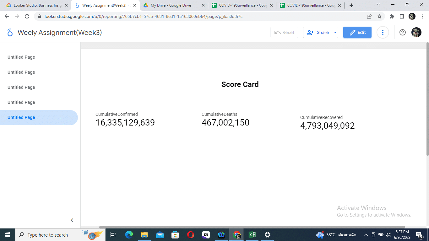
Score card – describes total confirmed, death and recovery cases, total number of days, starting dates and end dates.
World map – describes case load of Covid-19 per country world wide.
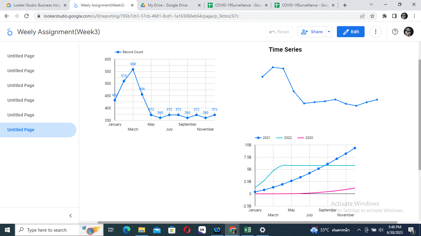
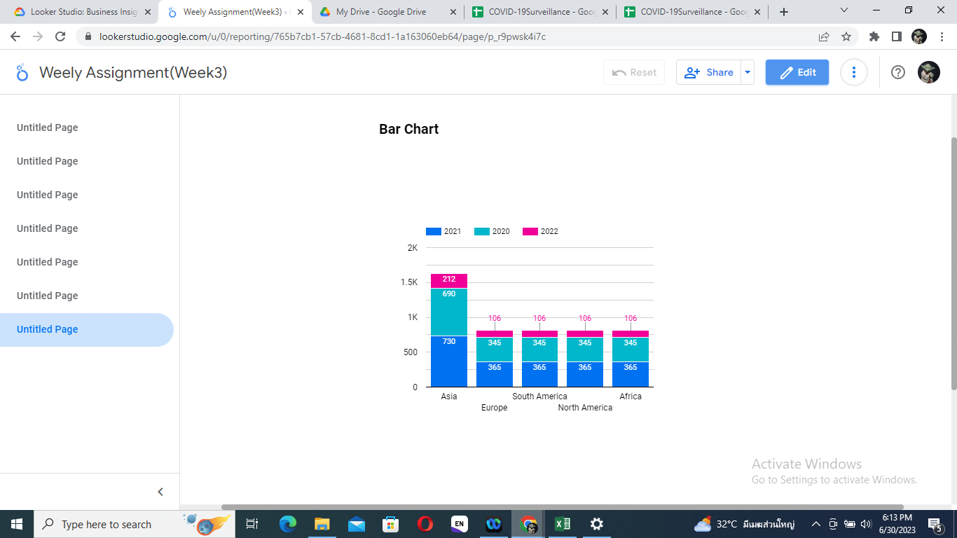
Bar chart, Line chart – shows total number of confirmed, death and recovery cases.
Download button – to download report of the dashboard in pdf format.
https://covid19.who.int/
The dashboard used chunking of numbers to enhance working memory.
The dashboard avoid grid lines encouraging to be focus for the viewer and thus enhancing pre-attention process.
The used of histogram to desxribe the trend of Covid-19 cases across the continents is appropriate.
The used of appropriate color and contrast to describe the total cases of Covid-19 cases across the globe is noticable.
Adding meaning (National flag of each country) in the dashboard helped enhancing the long term memory of the viewer and make it more recognizable.
Dear Collegue,
Thanks for the dashboard. It has many things to learn. Several controllers may be of valuable for the user to get the requrie information pin down in timely manner. Moreover, I like that you consider for the “reset filter” buttom and leave a room to update and modify the dashboard.
Dear Colleague,
The dashboard is fascinating which grasp well of the concept of perception and cognition. It is informatative and easy to follow. Personally I like that you are using gauge to describe total conuntries.